Generate Higher Conversions with Responsive Website Design

There was a time when flexible web layouts were reserved for only those businesses that could afford to enjoy the benefits of a luxurious and Responsive Website Design. But, now times are changing. So, Best Web Solutions provide you with a comprehensive range of web designs that could fit your desktops and mobiles equally.

With the ever-evolving screen size, responsive web design has also become more complicated. But, we have the capability to move in pace with the changing technologies. We make sure to not let the screen size be an obstacle to your success.

The Need to Use Responsive Website Design

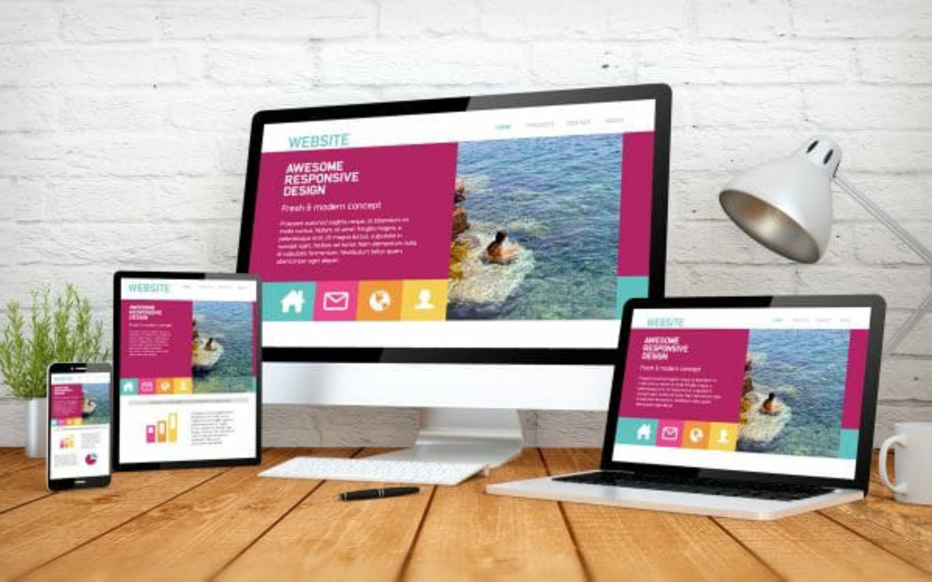
Whether your customers are viewing your site on a desktop or on mobile phones, they must encounter the best user experience. So, we always make sure that your website is just easy to use and navigate. This is the purpose of Responsive Website Design and the reasons that you must go for it includes:

Increased use of mobile phones – The use of mobile phones has increased considerably and that represents an enormous online opportunity. If you have a website that is not responsive, then there are chances that you’re missing out on potential customers. Our team of professional, responsive web designers strives to deliver high-end results for tablets, desktops, and mobile users. We make sure that every user experience is just excellent.

Quite a time saver and cost-effective choice – When it comes to responsive web design, it creates efficiency in development cost and time. The responsive web development approach will let us optimize your website inside out with a single design for various devices. Otherwise, without this design, you will have to spend resources and time building a separate site for mobile phones.

Effective for mobile search results – The Responsive Website Design will make your website search engine friendly and mobile friendly. When it comes to SEO, this responsive website will make it easier for you to benefit from the mobile search results. The optimized website will fit every screen size with equal capability. It is easier for search engines to locate you easily.


How Do We Work?

Our team follows a ‘mobile first approach’. This means we design components for every screen size for your website. So, the components must fill your desktops and mobile phones equally.

  • Mock-ups are also tested before sending them to the clients.
  • Final designs are shared with the clients for their feedback.
  • On the client's approval, our team strives to convert these designs into realities.
manr

Choose Us!

It’s true that more than 50% of people rely on their mobile phones to view websites. So, our main motive is to make your website look awesome and great on any screen. So, whenever we design or develop a website, we see to it that the website has a Responsive Website Design.

Our updated technologies and advanced approach will help your website gain complete optimization. Each and every design empowered by Best Web Solutions is responsive and fits every screen with ease.

A user may behave differently when using a mobile phone than he does when using a desktop. So, we keep that in mind and design the websites accordingly.

So, you’re ready for a responsive website design?

TOP